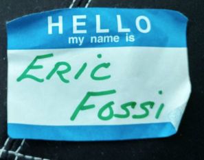
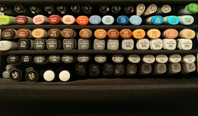
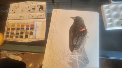
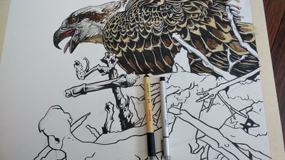
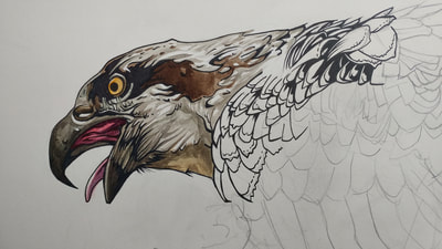
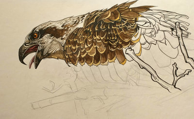
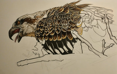
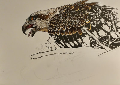
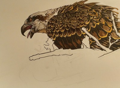
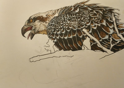
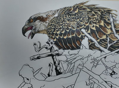
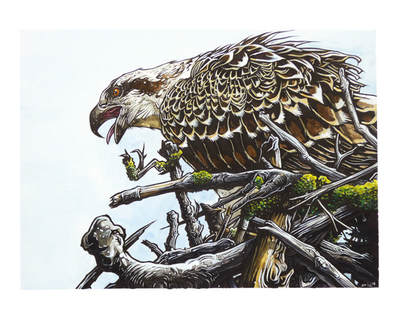
Lynx Ridge ShowAlright, so before we get too far into things, I wanted to address the show at Lynx Ridge. It went fairly well, unfortunately due to a cancelled meeting, there wasn't as big an audience as I would've liked, but nevertheless I still sold the Bald Eagle illustration (don't worry, prints are still available), and a few prints. The organizer did a great job though and everyone was very friendly, and it was a lovely establishment. my name tag from the show Weapon of ChoiceSo as you may see, I have started to venture away from the inks and Copic markers. Not completely, as I love working with these tools, I just feel like expanding my horizons. I have done a lot of practice watercolour to prepare myself for my first ink and watercolour piece (the Osprey Nest as seen here). Here is a list of some of the items used: -Bimoji brush pen medium bristle -Copic Multiliners -White Jelly Roller -FW Inks -HB Pencil -M. Graham tube watercolours -Premium Hot Press watercolour board A brief description of everything: The Bimoji brush pen is sort of throw back to the old days. My friend old friend Clement and I used to religiously use these old calligraphy brush pens in art school (can't remember the name). One side had the brush quill and the other side was a broad marker style nib. When I started watching these great Aaron Blaize videos from Inktober using the Bimoji brush pen, it brought me right back and I had to have one, so I found them at my local shop (Kensington Art Supply) for 5 bucks a pop and scored a couple for the road. I really like them, you really have to press hard with them which is perfect for me as I'm a very heavy handed artist. I like using very pressure sensitive tools such as ball point pens vs felt tip pens. The Copic Multiliners, and HB pencil are pretty self explanatory. I have a set of the refillable multiliners, and I like to use HB pencils. I know a lot of artists prefer using a harder pencil for their lines, but again this comes down to my "heavy hand" syndrome, and I find when I use hard pencils, I press too hard and leave sort of grooves in the paper. This is why I prefer a slightly softer HB or even sometimes a B pencil. The White Jelly Rollers work great as an opaque white ink to do fine details with. When the Jelly Roller doesn't cut it, I bust out the opaque white FW Ink with a synthetic nylon brush, round 2-6 depending on the level of detail. The M. Graham tubes are decent, pro level watercolours that also happen to be very affordable. At my store I they cost around 12-20 bucks a tube, and since I tend to avoid the expensive pigments, it's more like 12 bucks a tube. The Hot Press board is for ink and watercolour, and I explain later in further detail why I chose this. Drawing vs. PaintingOk, down to the meet of today's blog, I thought I'd start looking at processes. One thing that's great about drawing is that you can just sort of wing it and fly by the seat of your pants. With watercolour painting, I find this is less the case, although it is still very similar to working with the Copic markers, in that I do have to work in a direction from light to dark. I also encountered an issue that I didn't think would be such a problem, is that I found when I hit small areas around the inks with light pigment, the light pigment still dried over the dark inks causing them to get muted and blurred. I knew this would be an issue, I just didn't know it would be as big of an issue as it was. I ended up going over the light tips of the wings probably 3 times because of this, and darkening and repeating my inks. It makes you rethink your processes. I did a lot of reading other blogs before venturing into ink and watercolour, and I noticed many people talking about adding the bulk of the inks after the watercolour is done. This is really starting to make sense, and I will probably adjust my process to do this as much as possible. Process of an impatient artist Ok, so first thing is first. I started with a nice piece of Crescent Premium Hot Press Watercolour Board. There are 2 reasons I used this kind of board. First, I didn't have a wood board for stretching paper at the time of this watercolour, and without that, the paper would begin to buckle and warp as more washes are applied. The second reason is that I specifically wanted a hot press paper (smoother surface) so that I could get clean lines for my ink drawing application. Cold press paper has a far more toothy surface which is great for holding watercolour, but not as good fro drawing on. Hot press has a more similar tooth to a standard drawing paper or illustration board ideal for ink drawing. As you can see in the below images, I basically started with a pencil outline. Because I'm experimenting a bit, I didn't want to go in too heavily with the inks. I wanted to find the right balance between the two, so I did basic ink outlines and began with the watercolours. You can see this in the first image below. I was really happy with how this turned out. I wasn't too concerned with keeping white paper coming through, but I did keep some loose areas of white. Afterwards, I went back in with my jelly roller to bring white back in. For the watercolours, I'm mixing my tube paints, I'm using Burnt Umber and Cerulean Blue to make warm greys for the head of the bid. For the beak, I used a Phthalo Blue with my Burnt Umber to make a cooler grey. I used Naphthol Red mixed with a Phthalo Red Blue Shade to make the inner mouth colours and tinted it using my cool grey. The eye is an Indian Yellow tinted with a Naphthol Red and details done with black and white ink. In image 2, I've carried on with the watercolours. When I got into to the dark feathers, I was using clean applications of Burnt Umber and Sepia. I used Indian Yellow for the tips of the feathers, but at this point, I'm aware that I kind of want the deep black contrast of the inks, so I whip out the Bimojoi brush pen and start to define some real shadows which can be seen in the third image, I also know that the shadows are going to get even darker near the bottom of the Osprey, so I go even heavier with the inks. I'm also starting to map out some of the shapes of branches that I know are going to come in front of the bird. Again I use the Bimoji pen to get those nice thick lines. Line thickness is very important in relation to perspective, and with my illustrative style, I like really bold thick lines, the kind you often see with indie comic illustrators who draw predominantly in black and white. Next, I'll go over the process of the wing tips. I'm not really going here for what's "real" per say, what I really want is a bold illustration, so I like the feel of the contrasted lines of white over the brown. I didn't really like the look of the watercolour, I wanted it to pop more, so I went back in with my opaque white inks to outline the feathers. The problem is, this created a really "cool" colour because of the brown underneath, so I ended up trying to go back over it with a yellow watercolour which resulted in a muddying affect on the browns and inks below. I didn't really anticipate the light pigment of the yellow affecting the darks so intensely. At this point I was frustrated, but came up with an idea. I hopped over to Micheal's and bought some more acrylic ink. I got a Yellow Ochre and mixed it with the opaque white and that created a nice sort of creamy white. I reapplied this mix to the wing tips, achieving a much more desired look. Once the bulk of the osprey was completed, I started to work on the branches. I start out fairly conservatively with dark shadows so that I can allow the watercolours to shine through. Once the first couple washes are applied, then I go back in with the inks to create some nice contrasts, and then use the white ink to create some nice stark textures puncturing the darks to describe the feel of the different barks. I really brightened up the moss to give the overall image a nice kick of colour. The final touchups are applied all over the image to bring everything together. I add some highlights to the top feathers most exposed to direct sunlight and I tone down the whites on the lower feathers that would have more cast shadow. Well that's pretty much it for this piece. If you have any questions, feel free to leave them in the comments.
Peace, Eric
0 Comments
Leave a Reply. |
 RSS Feed